Azure Portal Efficiency: How to Fix the Collapsed Service Menu
If you log into the Azure Portal and find that your favorite service menus are suddenly missing or require an extra click to reveal, you aren't alone. In mid-2024, Microsoft updated the default "Service Menu Behavior" to a Collapsed state. While this "cleaner" look might appeal to some, for many power users and systems engineers, it's a direct hit to productivity.
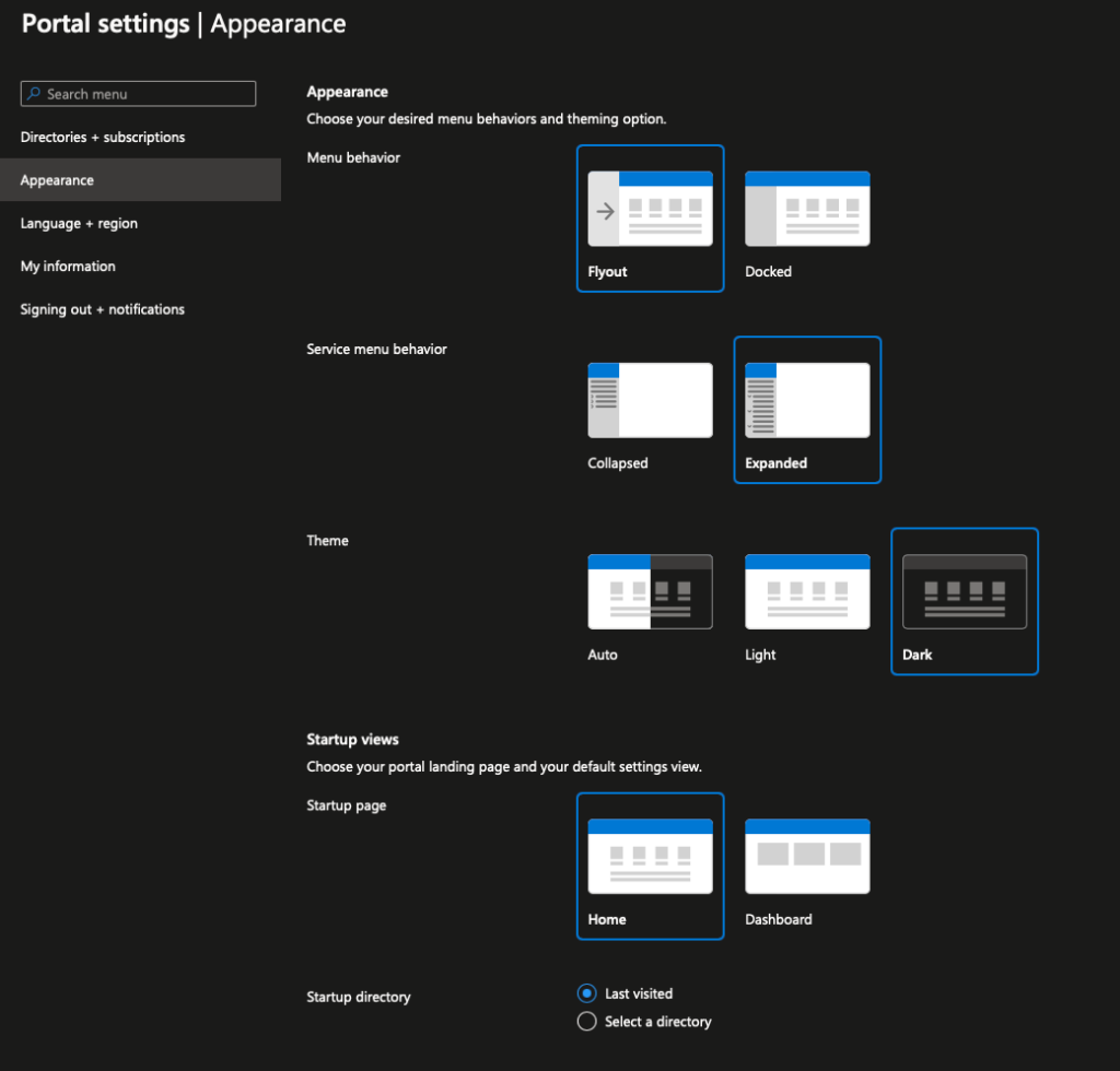
The Problem: Default "Collapsed" View
The transition to a collapsed menu means that the secondary navigation—where you find specific resource settings like "Access Control (IAM)", "Networking", or "Tags"—is hidden behind a flyout menu by default. This change forces an additional click for almost every navigation action within a resource.
The Community Signal: UX Friction
The shift has caused significant friction in the community, with many users reporting that it disrupts their decades-long muscle memory. On platforms like Reddit's r/azure, the consensus is clear: "clean" isn't always "efficient."
The Fix: Restore the "Expanded" Menu
The good news is that Microsoft allows you to personalize this behavior. You can revert to the classic Expanded view in just a few clicks.
Steps to Revert:
- Open Settings: Click the Cog-Wheel (Gear) icon in the top-right corner of the Azure Portal.
- Navigation: On the left-hand sidebar of the settings panel, click Appearance + startup views.
- Adjust Behavior: Locate the Service menu behavior section.
- Select Expanded: Change the setting from "Collapsed" to Expanded.
- Apply: Click the Apply button at the bottom of the panel.
Analysis & Guidance: A Productivity Perspective
In a 2026 retrospective, these small UX shifts often highlight the tension between "modern design" and "functional efficiency." For a cloud architect managing hundreds of resources daily, saving a single click per navigation adds up to hours of reclaimed time over a year.
Pro-Tip: While you're in the Appearance settings, also consider setting your Information density to "Compact" if you find yourself scrolling excessively through resource lists.
Stay updated on the latest intel by checking our Patches Dashboard.